Lightweight Load Testing on Windows 11: Building a Complete k6 + Flask + Plotly Pipeline Without the DevOps Overhead
Most load testing tutorials assume you’re running Linux, Docker, and a full observability stack — Prometheus for metrics, Grafana for dashboards, InfluxDB for storage. That’s fine for production environments, but when you just want to load-test a service from your home network using two Windows machines, the setup overhead can be absurd. You end up spending more time configuring infrastructure than actually testing.
This post walks through a complete, lightweight alternative: a k6 load testing pipeline that runs natively on Windows 11, collects system metrics via a Flask endpoint, and generates a beautiful interactive dashboard — all without Docker, Prometheus, Grafana, or any heavy tooling.
The full project is available on GitHub.
The Problem: Load Testing Shouldn’t Require a Platform Team
I had a simple goal: run load tests from one Windows 11 machine against a web application on another Windows 11 machine on the same home network, and see both the k6 performance metrics (response time, throughput, error rate) and the server’s resource usage (CPU, memory) on a single timeline.
The typical recommendation for this involves:
- Install Docker (or WSL2) on both machines
- Run Prometheus + Node Exporter on the server
- Configure k6 to push metrics to InfluxDB or Prometheus
- Run Grafana with pre-built dashboards
- Configure networking, firewall rules, and volume mounts
That’s a lot of moving parts for what should be a straightforward task. I wanted something I could set up in 15 minutes and explain to someone who’s never heard of Prometheus.
The Solution: Five Tools, Zero Services
The entire pipeline uses only:
| Tool | Role | Install |
|---|---|---|
| k6 | Load test runner | winget install Grafana.k6 |
| Flask | Application Under Test + metrics endpoint | pip install flask |
| psutil | System resource monitoring | pip install psutil |
| pandas | Data parsing and merging | pip install pandas |
| Plotly | Interactive HTML dashboard | pip install plotly |
No databases, no background services, no YAML configuration files. Everything runs as a simple process and produces plain files (JSON, JSONL, HTML).
Architecture: Two Machines, One Network
The setup splits cleanly across two machines:
Remote machine runs the Flask application — the target being tested. It exposes a /metrics endpoint that returns CPU, memory and disk usage as JSON using psutil. No separate monitoring agent needed.
Local machine runs k6 tests and a Python orchestrator that coordinates everything: starting a background metrics collector, launching k6, parsing the results, and generating the dashboard.
The data flow is:
- The orchestrator starts polling
/metricson the remote machine every second - k6 runs the load test, hitting the remote endpoints and writing results to JSON
- After k6 finishes, the orchestrator stops the metrics collector
- pandas parses and merges both datasets by timestamp
- Plotly generates a self-contained HTML dashboard
The Application Under Test
The Flask app is intentionally minimal — four endpoints:
@app.route("/")
def index():
    # Returns HTML: "Hello from the AUT – Load Test Target"

@app.route("/api/data")
def api_data():
    # Returns JSON with sample product data

@app.route("/api/submit", methods=["POST"])
def api_submit():
    # Accepts JSON and echoes it back

@app.route("/metrics")
def metrics():
    cpu_percent = psutil.cpu_percent(interval=0.1)
    mem = psutil.virtual_memory()
    disk = psutil.disk_usage("/")
    return jsonify({
        "cpu_percent": cpu_percent,
        "memory": {
            "total_gb": round(mem.total / (1024 ** 3), 2),
            "used_gb": round(mem.used / (1024 ** 3), 2),
            "percent": mem.percent,
        },
        "disk_percent": disk.percent,
        "timestamp": datetime.now(timezone.utc).isoformat(),
    })
The key design choice is embedding the /metrics endpoint directly in the Flask app. This eliminates the need for a separate monitoring agent entirely. Since psutil reads system stats directly from the OS, the metrics are accurate and real-time. The 100ms sample window in cpu_percent(interval=0.1) keeps the endpoint responsive even under load.
Running it is one command: python app.py. It binds to 0.0.0.0:5000 so it’s accessible from the network.
The k6 Test Scripts
I created two scripts — a load test and a stress test — each targeting all three application endpoints.
The load test simulates normal-to-heavy traffic:
export const options = {
  stages: [
    { duration: "30s", target: 10 }, // Warm up
    { duration: "30s", target: 50 }, // Ramp to peak
    { duration: "2m", target: 50 }, // Sustained load
    { duration: "30s", target: 0 }, // Cool down
  ],
  thresholds: {
    http_req_duration: ["p(95)<500"], // 95th percentile under 500ms
    http_req_failed: ["rate<0.05"], // Less than 5% error rate
  },
};
The stress test pushes harder and faster — ramping to 150 VUs with shorter sleep times between requests.
Both scripts use check() to verify every response:
const resData = http.get(`${BASE_URL}/api/data`);
check(resData, {
  "GET /api/data → status 200": (r) => r.status === 200,
  "GET /api/data → has products": (r) => {
    const body = JSON.parse(r.body);
    return body.products && body.products.length > 0;
  },
});
k6’s --out json=results.json flag writes every metric data point to a file, which the dashboard generator later parses.
The Metrics Collector
Rather than deploying a monitoring agent on the remote machine, the local machine polls the /metrics endpoint in a background thread:
class MetricsCollector:
    def __init__(self, metrics_url, output_file, interval=1.0):
        self._stop_event = threading.Event()
        self.samples = []

    def start(self):
        self._thread = threading.Thread(target=self._run, daemon=True)
        self._thread.start()

    def _run(self):
        while not self._stop_event.is_set():
            resp = requests.get(self.metrics_url, timeout=3)
            data = resp.json()
            self.samples.append(data)
            self._stop_event.wait(self.interval)  # Sleep or stop
This approach has a significant advantage: zero installation on the remote machine beyond the Flask app itself. The collector writes JSON Lines (one JSON object per line) for efficient streaming and easy parsing. It handles connection errors gracefully — if the remote is temporarily too busy to respond, it logs the error and keeps polling.
The Orchestrator: Tying It All Together
The generate_dashboard.py script is the brain. It coordinates the entire pipeline in sequence:
- Connectivity check — hits the remote URL and fails fast with a clear error if unreachable
- Start metrics collector — begins background polling before k6 starts
- Run k6 — executes the test as a subprocess
- Stop collector — ensures all metrics from the test period are captured
- Parse k6 output — reads the NDJSON file into a pandas DataFrame
- Parse system metrics — reads the JSONL file into another DataFrame
- Aggregate — groups k6 data into 1-second buckets (avg, p95, max response time, requests/sec)
- Merge — uses
pd.merge_asofto align k6 and system metrics by nearest timestamp - Generate dashboard — produces a self-contained HTML file with Plotly charts
The merge step is worth explaining. k6 records timestamps per-request (potentially thousands per second), while the metrics collector records one sample per second. Aggregating k6 data into 1-second buckets and then merging with merge_asof(direction="nearest", tolerance="2s") aligns them cleanly without requiring perfectly synchronised clocks.
One gotcha I hit: pandas datetime resolution mismatch. k6’s timestamps parsed as datetime64[ns, UTC] while the system metrics came in as datetime64[us, UTC]. Newer versions of pandas are strict about this in merge operations. The fix was simple — normalise both to the same resolution before merging:
left["timestamp"] = left["timestamp"].dt.as_unit("us")
right["timestamp"] = right["timestamp"].dt.as_unit("us")
The Dashboard
The generated HTML file is completely self-contained — Plotly.js is embedded inline, so it works offline with no external dependencies. It includes summary statistics and four interactive charts.
Summary Statistics
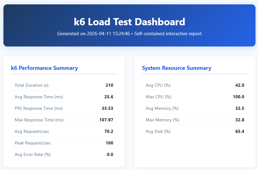
The dashboard header shows two summary panels side by side:
k6 Performance Summary captures the key load test numbers:
- Total Duration (s) — the wall-clock time of the entire test run (210 seconds / 3.5 minutes). This covers all k6 stages: warm-up, ramp to peak, sustained load, and cool-down.
- Avg Response Time (ms) — the arithmetic mean of all HTTP response durations (25.6ms). A low average suggests the server is handling requests comfortably, but this metric alone can mask occasional slow responses.
- P95 Response Time (ms) — the 95th percentile response time (35.53ms). This means 95% of all requests completed within 35.53ms. P95 is more useful than the average for understanding real user experience, because it captures the “worst case for most users” rather than being dragged down by the fast majority.
- Max Response Time (ms) — the single slowest response recorded (107.97ms). This is the absolute worst case — useful for identifying outliers, but a single spike doesn’t necessarily indicate a problem.
- Avg Requests/sec — the mean throughput over the test duration (70.2 req/s). This tells you the sustained load the server handled.
- Peak Requests/sec — the highest throughput recorded in any 1-second bucket (100 req/s). This is the maximum burst the server sustained.
- Avg Error Rate (%) — the percentage of requests that returned non-2xx status codes or timed out (0.0%). Zero means every request succeeded.
System Resource Summary shows the remote server’s health during the test:
- Avg CPU (%) — average CPU utilisation across the test (42.0%). Indicates the server had headroom — sustained CPU above 80% would be a warning sign.
- Max CPU (%) — the peak CPU reading (100.0%). The server hit full CPU utilisation at least once, likely during the sustained 50-VU phase. Worth investigating if this correlates with response time spikes.
- Avg Memory (%) — average memory utilisation (32.5%). Well within safe limits — memory wasn’t a bottleneck.
- Max Memory (%) — peak memory usage (32.8%). Almost identical to the average, confirming no memory leaks or allocation spikes.
- Avg Disk (%) — average disk utilisation (65.4%). This is the percentage of disk space used, not I/O throughput.
Response Time vs CPU Usage
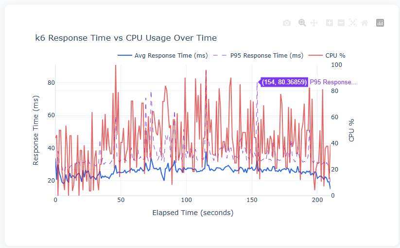
This dual-axis chart is the most important view in the dashboard. The left axis shows response time in milliseconds (blue solid line = average, purple dashed line = P95), while the right axis shows CPU percentage (red line).
The key insight is correlation: when CPU spikes to 80–100%, do response times spike too? In this test, the average response time stays remarkably stable around 20–30ms even as CPU fluctuates wildly between 20% and 100%. This tells us the Flask app is handling the load well — the CPU spikes are likely from other processes on the machine, not from the application struggling. The P95 line shows occasional jumps to 40–80ms, indicating that while most requests are fast, a small percentage take 2–3x longer during high-CPU moments.
Requests Per Second vs Memory Usage
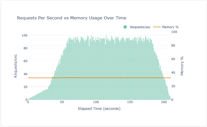
This chart overlays throughput (teal bars, left axis) with memory usage (orange line, right axis). The bar chart shape clearly shows the k6 test profile: ramp-up from 0 to ~100 req/s over the first 30 seconds, sustained at ~95–100 req/s during the 2-minute peak phase, then ramp-down in the final 30 seconds.
The flat memory line at ~33% is exactly what you want to see — it means the Flask application isn’t leaking memory under load. If this line trended upward during the sustained phase, it would indicate a memory leak that could eventually crash the server in a longer test.
Error Rate Over Time
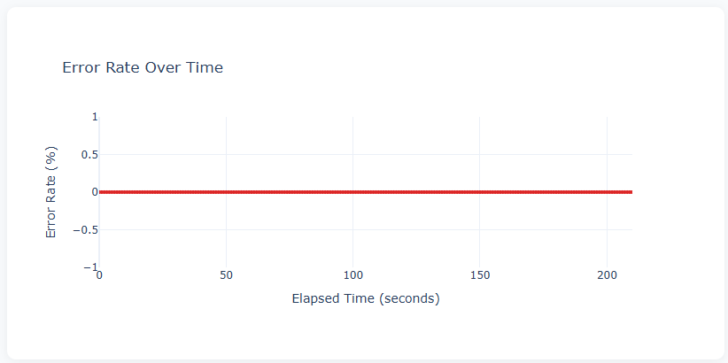
A flat line at 0% across the entire test duration — every request returned a successful response. This is the ideal result. In a stress test pushing beyond server capacity, you’d expect to see this line spike as the server starts returning 500 errors or timing out. The fact that it stayed at zero even at 100 req/s confirms the Flask app handled the load without failures.
Remote System Resource Usage
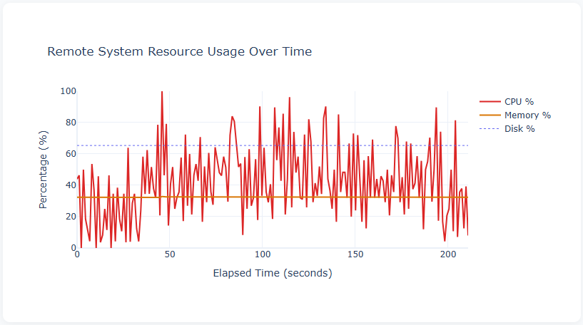
This chart shows all three system metrics on a single timeline:
- CPU % (red) — the most volatile metric, swinging between 0% and 100%. The high variance is typical of a multi-core Windows system where psutil reports aggregate CPU across all cores. The frequent spikes to 80–100% during the sustained load phase (50–190 seconds) show the server was working hard.
- Memory % (orange) — flat at ~33% throughout, confirming no memory pressure from the test.
- Disk % (blue dashed) — flat at ~65%, representing disk space utilisation rather than I/O activity. This baseline metric is useful for long-running tests where disk space could become an issue (e.g., logging).
The First Real Test Run
Running the load test against the Flask app on the remote machine:
k6 load test results:
  14,556 requests at 69 req/s over 3m30s
  0% error rate — all 29,112 checks passed
  P95 response time: 50.84ms (threshold: 500ms)
  184 system metric samples collected
Everything passed cleanly. The Flask development server handled 50 concurrent virtual users without breaking a sweat — which is expected for simple endpoints, but it’s good to have the numbers and the visual confirmation on the dashboard.
Why Not the Alternatives?
Prometheus + Grafana
The industry standard for monitoring and dashboards. For a production environment, it’s the right choice. But for a two-machine home network setup:
- Pros: Battle-tested, rich ecosystem, real-time streaming dashboards, alerting
- Cons: Requires running 3+ services (Prometheus, Grafana, optionally InfluxDB), YAML configuration, port management, and ideally Docker. On Windows without WSL, the setup is particularly painful. Grafana needs a running web server — you can’t just email someone an HTML file.
k6 Cloud
Grafana offers a hosted solution for k6 results.
- Pros: Zero infrastructure, beautiful dashboards, team collaboration
- Cons: Requires internet connectivity, paid beyond free tier limits, doesn’t include server-side resource metrics (you’d still need something like Prometheus for CPU/memory data)
Apache JMeter
The veteran of load testing tools.
- Pros: GUI-based test design, huge plugin ecosystem, built-in HTML report generation
- Cons: Java dependency (JVM overhead), XML-based test plans are hard to version control, the GUI can be sluggish, and it uses more resources than k6 for the same number of virtual users. k6’s JavaScript-based scripts are far more readable and maintainable.
Locust
Python-based load testing — a natural fit given the rest of the stack is Python.
- Pros: Python test scripts (no context-switching), built-in web UI, distributed mode
- Cons: The built-in UI is real-time only (no post-test report generation without plugins), and combining it with system metrics requires the same kind of custom integration I built here. k6 has better protocol support and lower per-VU overhead.
The Case for This Approach
The approach I’ve built isn’t better than Prometheus + Grafana in absolute terms. It’s better for this specific use case: ad-hoc load testing from a home network with minimal setup, producing a shareable artefact (the HTML dashboard) that anyone can open in a browser.
The advantages are:
- No services to run — everything is file-based
- No configuration files — no YAML, no Docker Compose, no database schemas
- Self-contained output — the dashboard is a single HTML file you can email, commit to Git, or archive
- Windows-native — no WSL, no Docker Desktop, no Linux knowledge required
- Easy to understand — the entire pipeline is ~400 lines of Python and ~80 lines of JavaScript
- Easy to extend — want to add a new chart? It’s a few lines of Plotly. Want to monitor a different metric? Add it to the Flask
/metricsendpoint.
The disadvantages are equally clear:
- No real-time streaming — you see results after the test, not during
- Polling-based metrics — 1-second resolution, not sub-second
- Single-machine load generation — k6 runs on one machine (though k6 supports distributed execution if needed)
- No alerting — it’s a reporting tool, not a monitoring system
Setting It Up: The 10-Minute Version
If you want to replicate this, clone the repo and follow these steps:
On the remote machine:
pip install flask psutil
python app.py
On the local machine:
winget install Grafana.k6
pip install requests pandas plotly
copy config.json.example config.json
Edit config.json with your remote machine’s IP or hostname:
{
  "remote_host": "YOUR-REMOTE-MACHINE",
  "remote_port": 5000,
  "remote_url": "http://192.168.x.x:5000"
}
Then run the test — the remote URL is read from your config automatically:
python generate_dashboard.py --test load
start results\dashboard.html
The config.json file is Git-ignored, so your network details stay private. All scripts read their defaults from this file, with the option to override via command-line flags.
The only fiddly part is Windows Firewall — you need to allow inbound TCP on port 5000 on the remote machine:
# Run as Administrator on the remote machine
netsh advfirewall firewall add rule name="Allow Flask Port 5000" dir=in action=allow protocol=TCP localport=5000
Key Takeaways
- Load testing doesn’t require a platform — for many use cases, k6 + a simple metrics endpoint + a Python script is all you need
- Embed your metrics endpoint — putting
/metricsin the Flask app itself eliminates the need for a separate monitoring agent - File-based pipelines are underrated — JSON in, HTML out, no databases, no services, no state to manage
- pandas
merge_asofis perfect for time-series alignment — it handles the clock skew and different sampling rates between k6 and the metrics collector elegantly - Self-contained HTML dashboards are shareable — Plotly.js embedded in a single file means anyone with a browser can explore the results, no server required
- Start simple, add complexity when you need it — if this approach stops being sufficient, migrating to Prometheus + Grafana is straightforward because the data shapes are already clean